Data Visualization: Turning Complex Data into Business Insights
Understanding Data Visualization and Its Importance
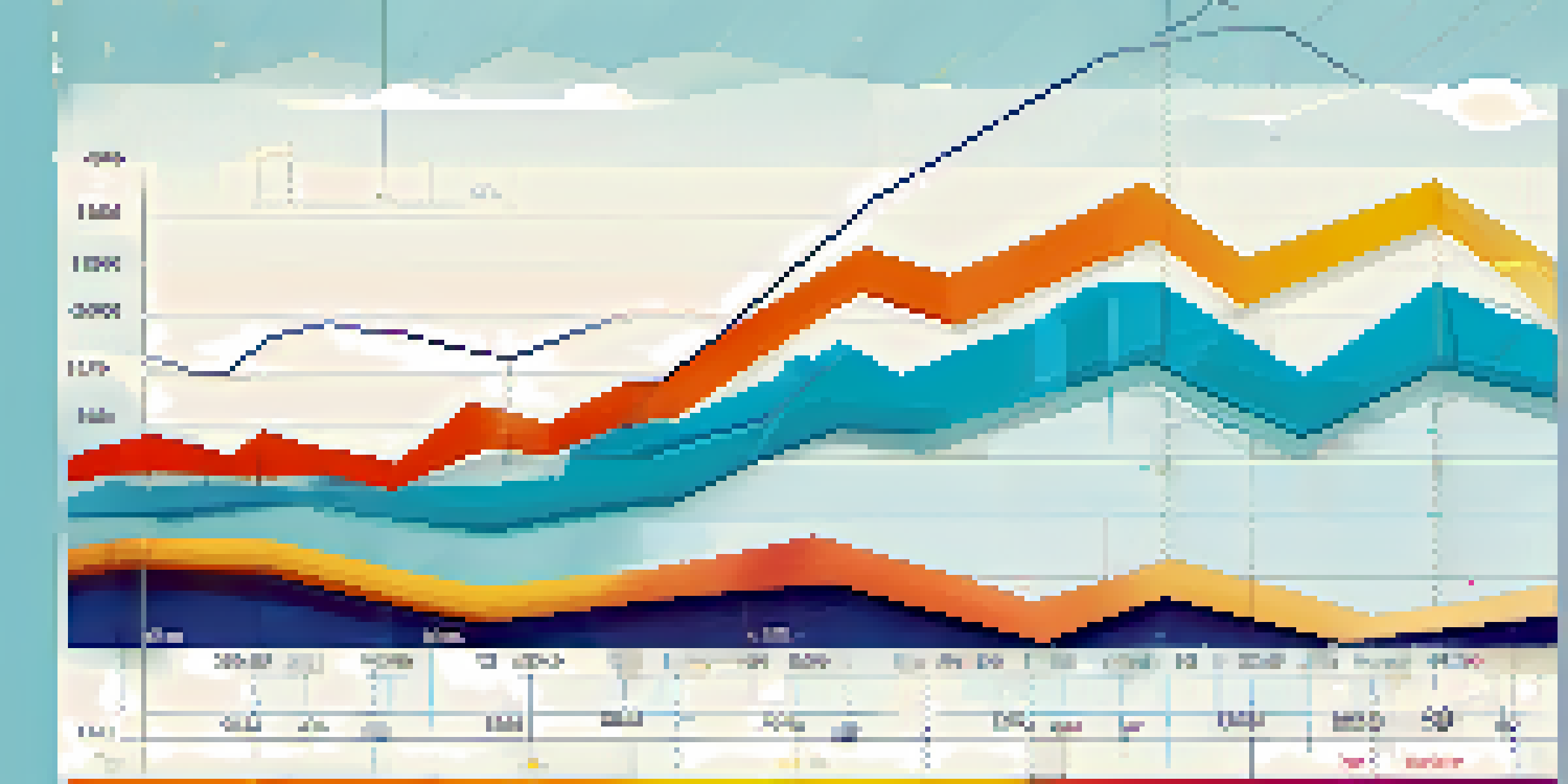
Data visualization is the graphical representation of information and data. It uses visual elements like charts, graphs, and maps to help people understand trends, outliers, and patterns in data. In today’s data-driven world, the ability to visualize data effectively is crucial for businesses to make informed decisions.
Data is the new oil, but like oil, data needs to be refined to be useful.
By transforming complex datasets into simple visuals, companies can quickly grasp essential insights that might be buried in raw data. For example, a line graph showing sales over time can immediately reveal seasonal trends, making it easier for businesses to strategize accordingly. This clarity is what makes data visualization a powerful tool in any decision-making process.
Moreover, effective data visualization fosters a stronger communication framework within teams. When everyone can visualize the same data, it leads to more productive discussions and collaborative problem-solving. In essence, it aligns teams towards common goals and enhances overall productivity.
The Role of Data Visualization in Business Strategy
Data visualization plays a pivotal role in shaping business strategies. It allows organizations to analyze market trends, customer behaviors, and operational efficiencies in a visually engaging manner. This analytical storytelling helps businesses understand where they stand and where they need to go.
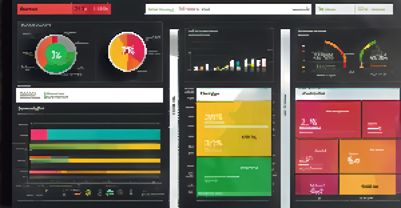
For instance, a well-designed dashboard can provide real-time insights into key performance indicators (KPIs), helping executives make data-backed decisions swiftly. Imagine having a visual representation of customer feedback that highlights areas needing improvement; it’s much easier to act upon than sifting through pages of text.
Data Visualization Drives Decisions
Effective data visualization transforms complex datasets into clear visuals, enabling businesses to make informed decisions quickly.
Ultimately, leveraging data visualization in strategy formulation ensures that businesses remain agile. By continuously monitoring and visualizing data, companies can pivot their strategies based on insights, enabling them to stay ahead of the competition.
Common Tools for Data Visualization: Making the Right Choice
There’s a multitude of tools available for data visualization, each catering to different needs and expertise levels. Some popular tools include Tableau, Power BI, and Google Data Studio. Choosing the right tool depends on factors like the data complexity, the audience, and the specific goals of the visualization.
Without data, you're just another person with an opinion.
For example, Tableau is known for its powerful capabilities and flexibility, making it suitable for enterprises with large datasets. On the other hand, Google Data Studio is excellent for teams who need a user-friendly option for quick reports and dashboards. Understanding your team's requirements can help streamline this decision-making process.
It’s also worth considering the integration capabilities of these tools with your existing data systems. A seamless connection to your data sources can save time and improve efficiency. By investing time in selecting the right tool, you set the foundation for effective data visualization practices.
Best Practices for Creating Effective Data Visualizations
Creating effective data visualizations requires a blend of art and science. Start with a clear goal in mind: what story do you want the data to tell? Choosing the right type of visualization—be it a bar chart, pie chart, or scatter plot—can significantly impact how the audience interprets the data.
For example, if you want to show how parts contribute to a whole, a pie chart might be more effective than a bar chart. Additionally, keeping your visuals uncluttered and focused on key messages enhances viewer comprehension. Using colors, labels, and legends thoughtfully can also guide the audience's understanding.
Choosing the Right Tools Matters
Selecting the appropriate data visualization tools based on the team's needs and integration capabilities is crucial for successful implementation.
Lastly, always consider your audience while designing visualizations. Tailoring the complexity and style of the visuals to match the audience’s expertise ensures engagement and clarity. Remember, the goal is to make complex data accessible and actionable.
Real-World Examples of Data Visualization Success
Many companies have successfully harnessed the power of data visualization to drive business success. For instance, Netflix utilizes data visualization to analyze user behavior and preferences. By visualizing this data, they can recommend shows and films tailored to individual tastes, enhancing user engagement and satisfaction.
Another great example is Starbucks, which uses geospatial data visualization to determine the optimal locations for new stores. By mapping out customer demographics and competitors, they make informed decisions that minimize risks and maximize profitability. These real-world applications highlight the transformative potential of effective data visualization.
These success stories demonstrate that when data is presented visually, it becomes not just information, but a strategic asset. Businesses that embrace data visualization can unlock insights that drive innovation and growth.
Challenges in Data Visualization and How to Overcome Them
Despite its numerous benefits, data visualization comes with its own set of challenges. One common issue is data overload, where too much information is presented at once, making it hard for viewers to focus on the key insights. To avoid this, prioritize the most relevant data and consider breaking complex visuals into simpler components.
Another challenge is ensuring data accuracy. Misleading visuals can lead to incorrect interpretations and poor decision-making. Therefore, it’s essential to double-check data sources and keep the visuals up-to-date. Transparency about data origins and methods also builds trust with the audience.
Overcoming Visualization Challenges
Addressing issues like data overload, accuracy, and skill gaps can enhance the effectiveness of data visualization efforts in businesses.
Finally, skill gaps in data visualization can hinder effectiveness. Investing in training for team members and encouraging collaboration with data specialists can bridge this gap. By addressing these challenges head-on, businesses can enhance their data visualization efforts and achieve better outcomes.
The Future of Data Visualization in Business
As technology continues to evolve, the future of data visualization looks promising. The integration of artificial intelligence (AI) and machine learning is set to revolutionize how businesses interpret data. These technologies can automate the process of generating insights from complex datasets, making visualization even more accessible.
Moreover, interactive visualizations are gaining traction, allowing users to explore data dynamically. Imagine being able to filter data on a dashboard to see specific trends or outliers; this level of interactivity not only enhances understanding but also engages users more deeply.

In the coming years, we can expect even more innovative tools and techniques that will simplify data visualization further. As businesses continue to embrace these advancements, the ability to turn complex data into actionable insights will become an essential competency.