Data Visualization and User Experience: A Powerful Duo
Understanding Data Visualization: More Than Just Charts
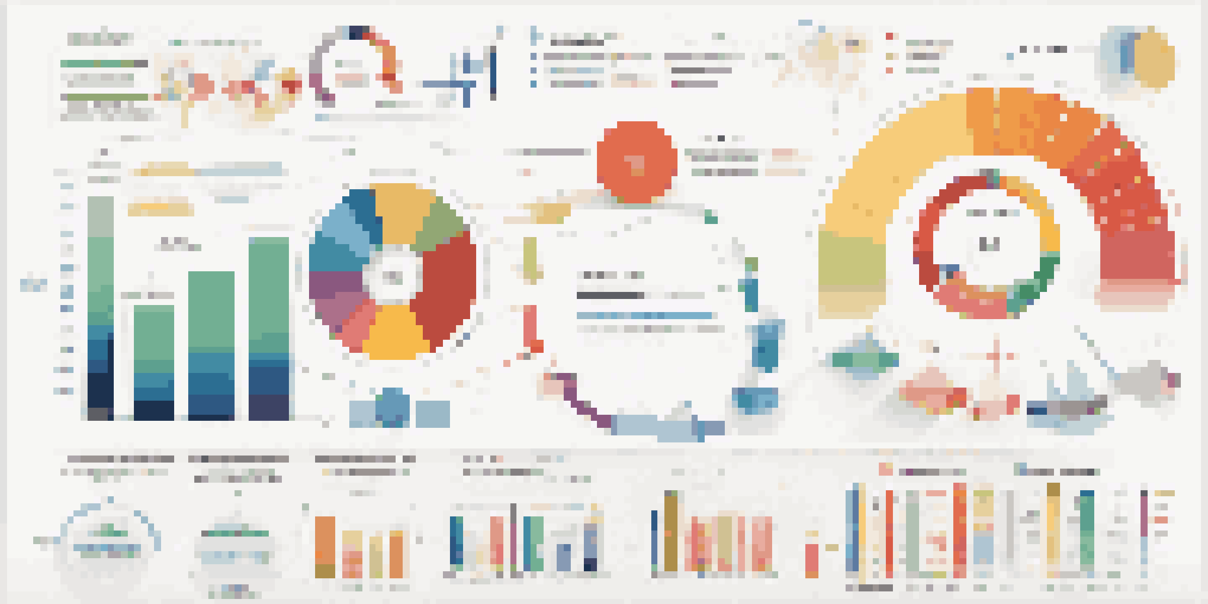
Data visualization is the representation of information in a graphical format. It helps to simplify complex data sets, making patterns and trends easily recognizable. Imagine trying to find your way through a dense forest; a clear map makes the journey much easier. Similarly, visualizations act as maps for data, guiding users through vast amounts of information.
Data visualization is not just about making data look pretty; it's about making data understandable.
At its core, data visualization transforms numbers and statistics into images that tell a story. Think of a bar chart showing sales growth over time; it not only presents data but also communicates progress and success. This storytelling aspect is crucial in helping users to quickly grasp insights and make informed decisions.
Moreover, effective data visualization engages users, encouraging them to explore data further. When users see a compelling visual, they’re more likely to interact with it, diving deeper into the insights it offers. This interaction fosters a more meaningful connection between the user and the data, ultimately enhancing their experience.
The Importance of User Experience in Data Interaction
User experience (UX) focuses on how users interact with a product, emphasizing ease of use and satisfaction. When it comes to data visualization, UX plays a critical role in determining how effectively users can interpret information. A well-designed interface ensures that the visualizations are not only appealing but also intuitive and accessible.
Imagine navigating a website with confusing layouts and hard-to-read charts; it can quickly lead to frustration. Conversely, a clean and structured design allows users to focus on the data rather than getting lost in the visuals. Good UX encourages users to engage with the data without feeling overwhelmed, leading to a more enjoyable experience.
Data Visualization Simplifies Insights
By transforming complex data into visual formats, data visualization helps users quickly recognize patterns and trends.
Furthermore, a positive UX can significantly impact the retention of information. When users find visualizations easy to understand and interact with, they’re more likely to remember the insights gained. This retention is crucial in today’s fast-paced environment, where quick decisions are often necessary.
How Data Visualization Enhances User Experience
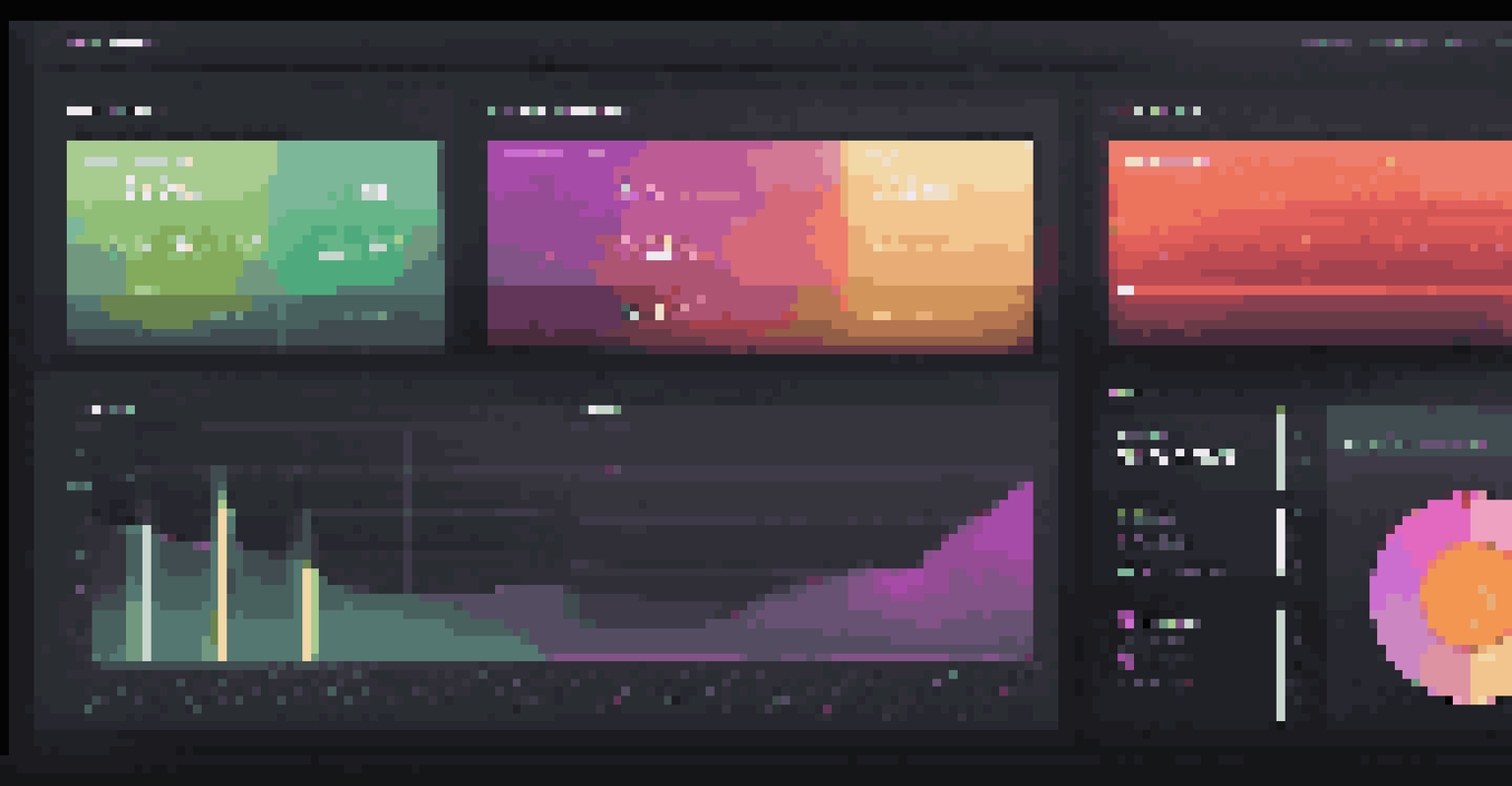
Data visualization can transform user experience by making complex information digestible. By utilizing visuals like graphs, heat maps, or infographics, users can quickly identify key trends and outliers. For instance, a scatter plot can reveal correlations that might go unnoticed in a table of numbers, directly impacting decision-making processes.
A picture is worth a thousand words, but a visualization is worth a thousand pictures.
Moreover, engaging visualizations can evoke emotions, making the data more relatable. A well-crafted infographic that tells a story can resonate with users and create a personal connection, encouraging them to take action. This emotional engagement is vital in ensuring that users not only understand the data but also feel motivated to act on it.
Additionally, visualizations can cater to different learning styles, accommodating a broader audience. Some users may grasp concepts better through visuals, while others prefer textual information. By offering a range of visualization methods, you can create a more inclusive user experience that meets diverse needs.
Best Practices for Combining Data Visualization and UX
To create a powerful synergy between data visualization and user experience, start with clarity. Ensure that your visualizations are straightforward and avoid clutter. A simple, well-labeled chart can convey information more effectively than a complex one filled with unnecessary details.
Next, choose the right type of visualization for your data. Not all data is suited for the same type of chart; understanding the nature of your data will guide you in selecting the most effective format. For example, a line graph is ideal for showing trends over time, while pie charts work well for representing parts of a whole.
User Experience Enhances Engagement
A well-designed user experience ensures that data visualizations are intuitive and accessible, encouraging users to interact with the data.
Lastly, consider user feedback during the design process. Engaging users in testing your visualizations can provide invaluable insights. Their experiences and preferences can help you refine your designs, ensuring they resonate with the target audience and enhance overall user experience.
The Role of Color and Design in Data Visualization
Color and design choices significantly impact the effectiveness of data visualization. A thoughtful color palette can enhance understanding and draw attention to key data points. For instance, using contrasting colors can help differentiate between various datasets, making comparisons clearer.
However, it’s essential to use colors judiciously; overwhelming visuals with too many colors can confuse users. A harmonious design that balances color with whitespace allows users to focus on the most important information. This balance leads to a more effective and aesthetically pleasing visualization.
Additionally, design elements such as fonts and icons play a crucial role in user experience. Consistent typography and intuitive icons can guide users through the visualization, reinforcing their understanding. Together, these design aspects can create a cohesive visual narrative that enhances user engagement.
Case Studies: Successful Data Visualization in Action
Examining successful case studies can provide valuable insights into the power of data visualization and UX. For example, a well-known health organization used interactive dashboards to present COVID-19 data. These visualizations allowed users to explore trends, view statistics by region, and understand the pandemic's impact at a glance.
Another compelling case is an online retailer that implemented data visualization to analyze customer behavior. By presenting user data through engaging visual formats, they identified shopping patterns and improved their inventory management. This not only enhanced user experience but also drove sales growth.
Color and Design Impact Understanding
Thoughtful color and design choices in data visualization can significantly enhance user comprehension and engagement.
These examples highlight how effective data visualization can lead to significant improvements in user experience and decision-making. They demonstrate that when data is presented clearly and engagingly, users are more likely to interact with it, leading to positive outcomes for both users and organizations.
The Future of Data Visualization and User Experience
As technology continues to evolve, the future of data visualization and user experience looks promising. With advancements in artificial intelligence and machine learning, we can expect more personalized and dynamic visualizations. These innovations will allow users to interact with data in ways that were previously unimaginable.
Moreover, the rise of virtual and augmented reality offers exciting opportunities for immersive data experiences. Imagine being able to walk through a 3D representation of complex data sets, gaining insights in a more engaging and interactive manner. Such experiences could revolutionize how users engage with information.

Ultimately, the combination of data visualization and user experience will only grow in importance. As data becomes increasingly integral to decision-making across sectors, ensuring that users can effectively interpret and interact with it will be crucial. Embracing this powerful duo will undoubtedly shape the future of information consumption.