Data Visualization for Health Care: Improving Patient Outcomes
Understanding Data Visualization in Health Care
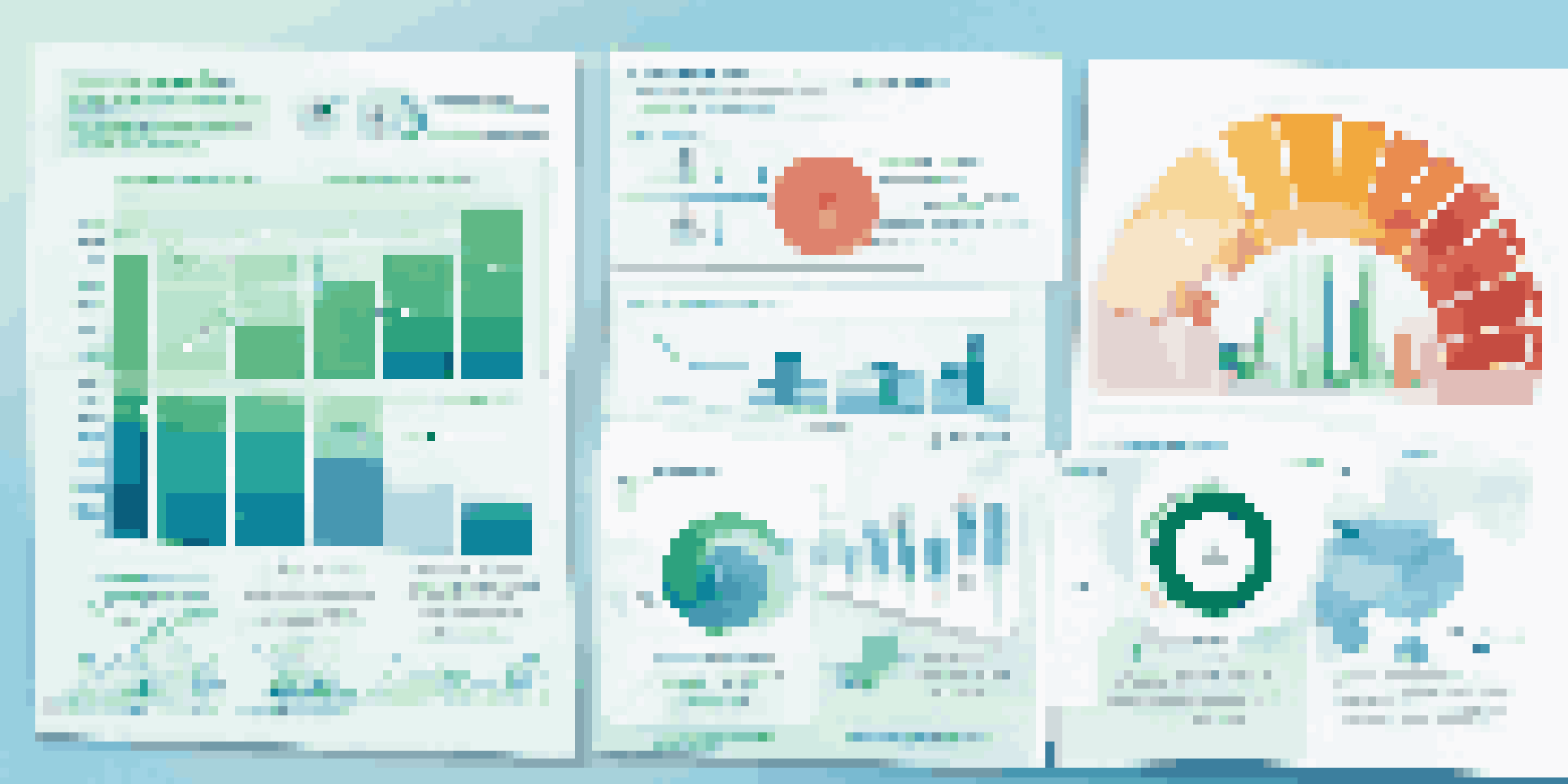
Data visualization is the graphical representation of information and data. In health care, it transforms complex datasets into visual formats like charts, graphs, and dashboards. This makes it easier for healthcare professionals to interpret and analyze critical information quickly.
Data visualization is not just a way to present data, it is a way to communicate information clearly and efficiently to users.
For example, a hospital might use a pie chart to show patient demographics, allowing staff to identify trends in age or gender that could inform treatment approaches. By making data more accessible, visualization enhances decision-making processes in medical settings.
Moreover, visual tools can help track patient outcomes over time, fostering a deeper understanding of the effectiveness of treatments. This visual clarity ensures that essential insights do not get lost in a sea of numbers.
The Role of Data Visualization in Patient Safety
Patient safety is paramount in healthcare, and data visualization plays a critical role in this area. By visualizing data related to incidents, like medication errors or falls, hospitals can identify patterns and intervene effectively. For instance, heat maps can pinpoint which wards are most prone to incidents.

With these visual insights, healthcare providers can implement targeted safety measures, such as increasing staff training in high-risk areas. This proactive approach not only reduces errors but also fosters a culture of safety within healthcare institutions.
Visual Data Aids Decision-Making
Data visualization transforms complex health data into accessible formats, enhancing decision-making for healthcare professionals.
Additionally, visualizing safety data helps in communicating risks to stakeholders, from management to patients themselves. This transparency builds trust and encourages a collaborative effort towards improving patient safety.
Enhancing Patient Engagement through Visualization
Data visualization can significantly enhance patient engagement, making health information more understandable. For example, interactive dashboards allow patients to track their health metrics, such as blood pressure or blood sugar levels, in a user-friendly manner. This empowers patients to take an active role in their care.
The greatest value of a picture is when it forces us to notice what we never expected to see.
When patients understand their health data visually, it can boost motivation and adherence to treatment plans. Imagine a diabetes patient using a colorful graph to see how their lifestyle changes impact their blood sugar levels; this can be a powerful motivator for continued healthy choices.
Moreover, healthcare providers can use visual tools in consultations to explain diagnoses and treatment options clearly. By breaking down complex medical data into digestible visuals, they can foster a more collaborative and informed relationship with their patients.
Streamlining Clinical Workflows with Visualization
Effective clinical workflows are essential for providing high-quality care, and data visualization can streamline these processes. Visual tools can help staff track patient flow, identify bottlenecks, and optimize resource allocation. For instance, real-time dashboards can display patient wait times and staff availability.
This immediate access to visual data allows healthcare teams to make quick decisions, improving efficiency and patient satisfaction. Imagine a busy emergency room where staff can see at a glance which patients need immediate attention without sifting through paperwork.
Improving Patient Safety with Insights
By visualizing incident data, healthcare facilities can identify patterns and implement targeted safety measures to reduce errors.
Additionally, visualizing workflow data can uncover trends that inform long-term improvements. By analyzing patterns in patient admissions or discharge times, healthcare facilities can implement changes that enhance operational efficiency.
Using Visualization for Population Health Management
Population health management is all about understanding the health outcomes of groups of individuals, and data visualization is key to this effort. By visualizing health data across different demographics, healthcare providers can identify at-risk populations and tailor interventions accordingly. For example, a bar graph showing vaccination rates by region can highlight areas that need more outreach.
Moreover, visual analytics can help track the effectiveness of public health initiatives over time. For instance, a line graph can illustrate the decline in disease incidence after a vaccination campaign, providing evidence of its success.
This approach not only improves individual care but also supports broader public health goals. By harnessing the power of visualization, healthcare organizations can make informed decisions that benefit entire communities.
The Impact of Data Visualization on Research and Innovation
In the realm of medical research, data visualization is a game changer. Researchers often deal with vast amounts of data, and visual tools can help uncover patterns and insights that might otherwise go unnoticed. For instance, scatter plots can reveal correlations between different treatment outcomes and patient characteristics.
By visualizing research data, scientists can communicate their findings more effectively, making it easier for peers and stakeholders to grasp complex concepts. This clarity can lead to more robust discussions and inspire innovative approaches to treatment.
Enhancing Patient Engagement Effectively
Interactive visual tools empower patients to track their health metrics, fostering a collaborative approach to their care.
Furthermore, visualization aids in the dissemination of research results to the public, enhancing understanding and support for new medical advancements. When data is presented visually, it becomes more relatable and impactful, fostering greater appreciation for ongoing research efforts.
Challenges and Best Practices in Health Care Visualization
While data visualization offers many benefits, it also comes with challenges. One major issue is ensuring data accuracy and integrity; visualizations based on flawed data can lead to misinformed decisions. Therefore, it's crucial to implement best practices in data collection and processing.
Moreover, healthcare professionals must be trained to interpret visualizations correctly. Misinterpretation can occur if staff are not familiar with the visualization tools, so ongoing education is essential. Providing clear guidelines on how to read and use visual data can mitigate this risk.

Finally, accessibility is key. Visualizations should be designed with all users in mind, including those with visual impairments. By prioritizing inclusivity in design, healthcare organizations can ensure that data visualizations serve everyone effectively.