Data Visualization for Non-Technical Users: A Simple Guide
Understanding Data Visualization: What It Is and Why It Matters
Data visualization is simply the presentation of data in a visual format, such as charts or graphs. This method allows us to quickly grasp complex information and identify patterns, trends, and outliers. For non-technical users, understanding the basics of data visualization is crucial because it empowers decision-making and enhances communication.
Data is the new oil, and data visualization is the oil refinery.
Imagine trying to understand a mountain of numbers; it can feel overwhelming. However, when that data is transformed into a colorful pie chart, the insights become clearer. This visual approach can make data more engaging and easier to digest, making it accessible to everyone, regardless of their technical background.
Ultimately, data visualization is about storytelling with data. By converting raw numbers into visual formats, we can narrate a compelling story that resonates with our audience and drives informed decisions.
Choosing the Right Types of Visualizations
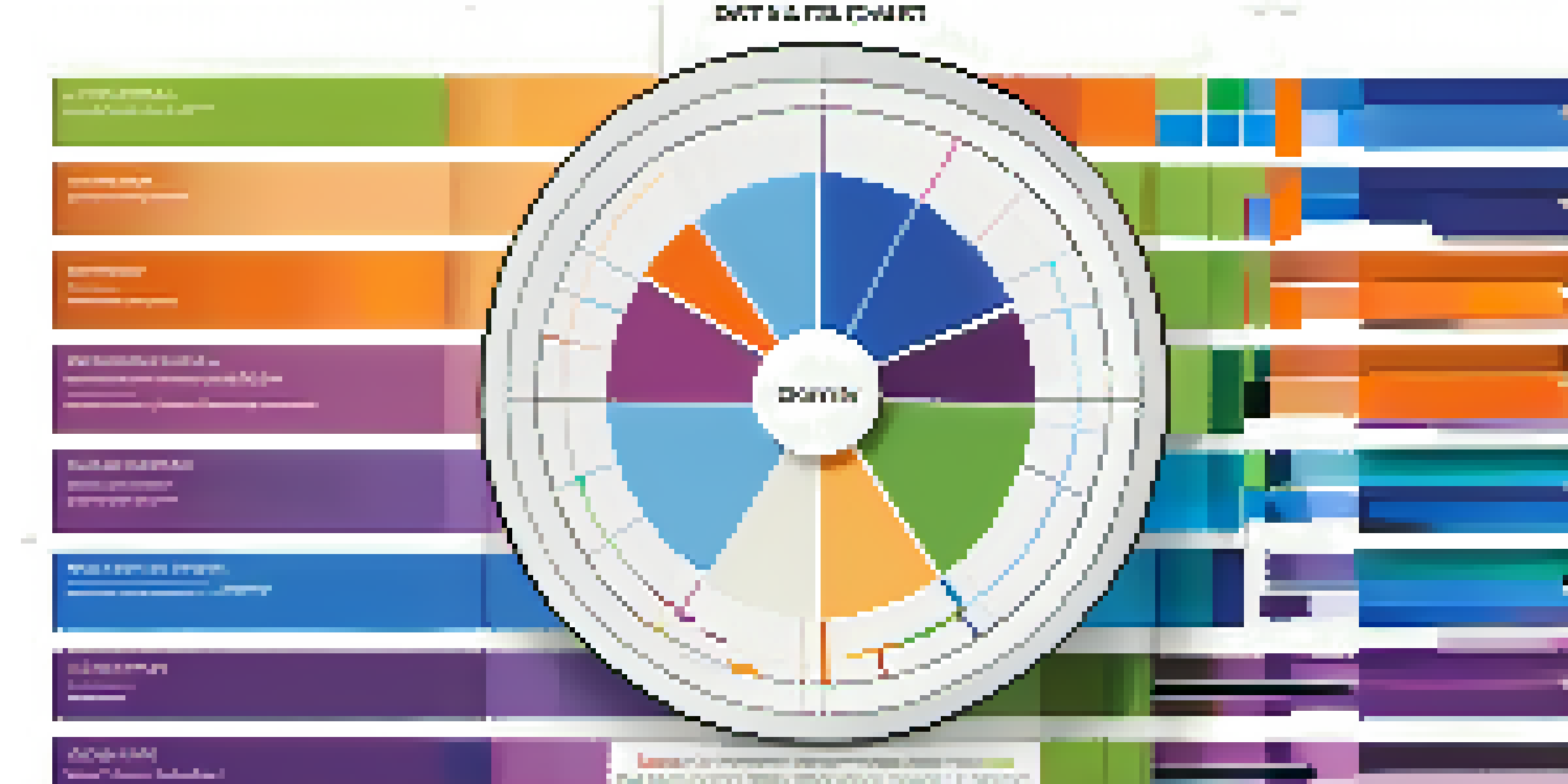
Not all data visualizations are created equal; each type serves a specific purpose. For instance, bar charts are excellent for comparing quantities, while line graphs are great for showcasing trends over time. Understanding the strengths of different visualization types can help you convey your message effectively.
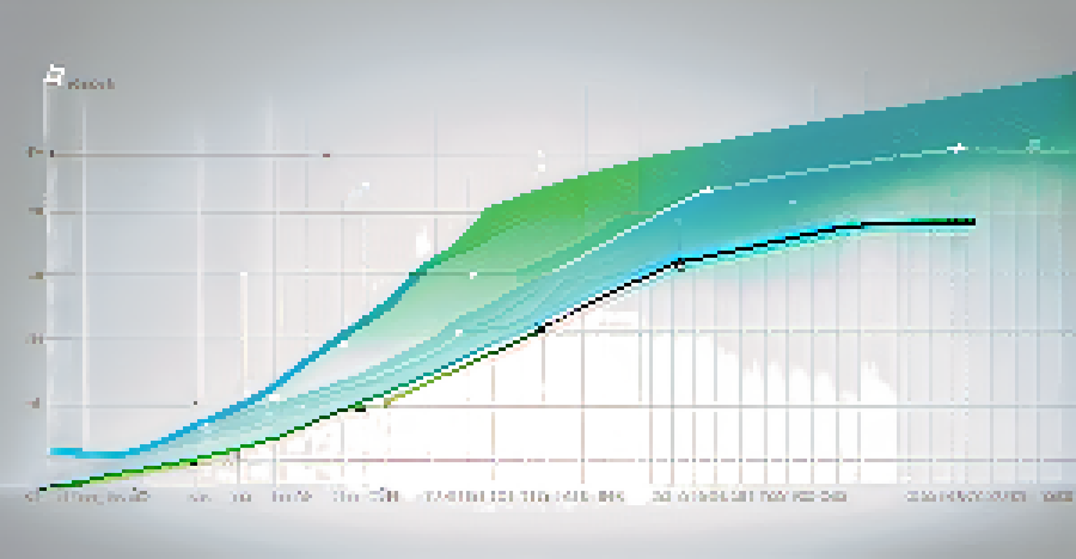
Think of it like choosing the right tool for a job. If you're baking, you wouldn’t use a hammer to mix your ingredients. Similarly, if you want to show trends, a line chart would be much more effective than a pie chart. Selecting the right visualization can drastically improve clarity and impact.
Data Visualization Simplifies Insights
Transforming data into visual formats like charts and graphs makes complex information easier to understand and analyze.
To make the best choice, consider the story you want to tell. What are the key points you want to highlight? By aligning your data with the appropriate visualization, you enhance your audience's understanding and engagement.
Common Tools for Creating Visualizations
In today's digital landscape, several user-friendly tools can help you create stunning visualizations without needing advanced technical skills. Platforms like Canva, Google Data Studio, and Tableau Public offer intuitive interfaces that allow you to drag and drop elements to form your visual stories. These tools cater to non-technical users and provide templates to get you started quickly.
The greatest value of a picture is when it forces us to notice what we never expected to see.
Using these tools is like painting on a canvas; you can choose colors, shapes, and styles that fit your narrative. Many also offer built-in tutorials, making it easy for beginners to learn the ropes of data visualization. With a little practice, you can create visuals that not only look good but also enhance your data's message.
Remember, the key is to experiment and find the tool that best suits your needs. Each tool has its unique features, so don’t hesitate to explore and discover which one allows your creativity to shine.
Best Practices for Effective Data Visualization
While creating visualizations, certain best practices can significantly enhance their effectiveness. First, keep it simple—avoid clutter and focus on the key message you want to convey. A clean, straightforward design ensures that your audience can easily interpret the information without feeling overwhelmed.
Another important aspect is the use of color. Colors can evoke emotions and draw attention, but too many can be distracting. Stick to a cohesive color palette that complements your data and enhances readability, much like choosing the right outfit for an occasion.
Choose Visuals Wisely for Clarity
Selecting the right type of visualization enhances communication and effectively conveys the intended message.
Lastly, always label your visuals clearly. Titles, axes, and legends provide context that helps your audience understand the data. By incorporating these best practices, you can create visualizations that resonate and leave a lasting impression.
Interpreting Visualizations: Making Sense of the Data
Once you've created your visualizations, the next step is interpretation. This involves analyzing the visuals to extract meaningful insights. For non-technical users, this might seem daunting, but it’s similar to reading a story—look for the main characters (data points) and the plot (trends).
Ask yourself questions: What trends do I see? Are there any surprising results? This analytical approach helps you connect the dots and understand the bigger picture. Just like a detective piecing together clues, interpreting visual data can lead to valuable conclusions.
Don’t forget to share your findings with others. Discussing your visualizations can provide new perspectives and insights, enriching your understanding even further. Collaboration often unveils layers of meaning that you might not see on your own.
Overcoming Common Challenges in Data Visualization
Even with the best intentions, creating effective visualizations can come with challenges. One common issue is data overload—presenting too much information at once can confuse your audience. It’s essential to prioritize the data that truly matters for your message, similar to how a film editor cuts unnecessary scenes to maintain a clear storyline.
Another hurdle is ensuring accuracy. Misrepresenting data can lead to misunderstandings and poor decisions. Always double-check your figures and the visual representation to ensure they align. Like a chef tasting their dish, reviewing your visualization helps guarantee it’s just right.
Continuous Learning in Visualization
As data visualization evolves, ongoing education and community engagement can help improve skills and creativity.
Lastly, don’t fear feedback. Sharing your visualizations with peers can lead to constructive criticism that improves your work. Embracing feedback is a crucial part of growth, allowing you to refine your skills and create even more impactful visualizations.
Continuing Your Data Visualization Journey
Data visualization is an evolving field, and there’s always more to learn. As you become more comfortable with the basics, consider diving deeper into more advanced techniques or exploring new tools. Online courses, webinars, and tutorials can provide valuable insights and keep your skills sharp.
Think of your data visualization journey as a road trip; the more you explore, the more sights you’ll see. Each new skill you acquire opens up opportunities to create richer, more engaging visualizations. Plus, the more you practice, the more confident you’ll become.

Don’t forget to join communities or forums dedicated to data visualization. Engaging with like-minded individuals can spark creativity, inspire new ideas, and provide support as you continue on your path to becoming a proficient data storyteller.