Exploring Geographic Information Systems for Data Visualization

Understanding Geographic Information Systems (GIS)
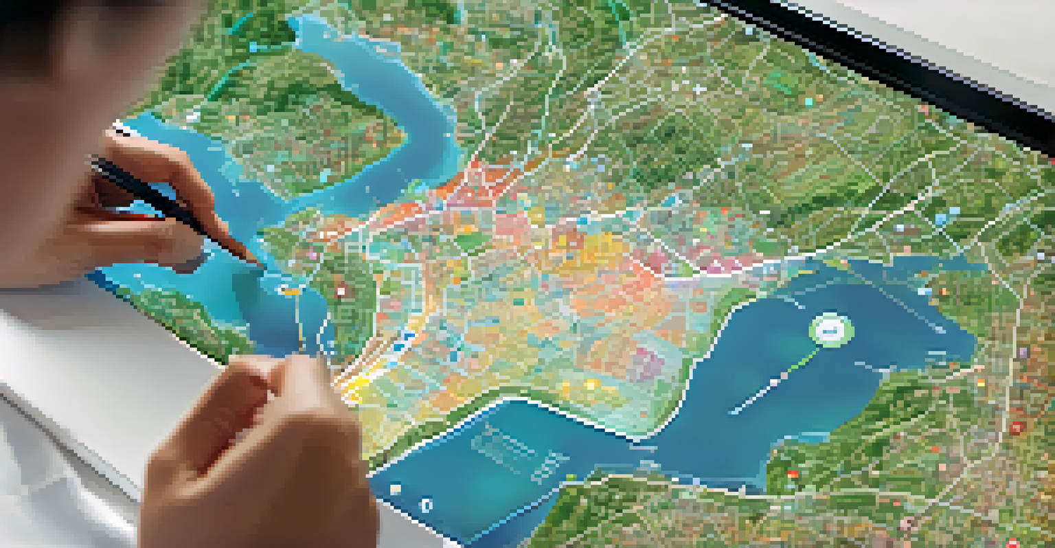
Geographic Information Systems, or GIS, are powerful tools that allow us to visualize and analyze spatial data. They combine hardware, software, and data to capture, manage, and present geographic information. At its core, GIS helps us understand patterns and relationships in data that are location-based, making it invaluable for decision-making across various fields.
Geographic information systems are a powerful technology that helps us understand our world, supporting decision-making in various fields.
Imagine trying to find the best route for a delivery truck in a city. Without GIS, this involves manually sifting through maps and data, which can be time-consuming and prone to errors. With GIS, you can quickly visualize traffic patterns, road conditions, and delivery locations all in one place, leading to more efficient route planning.
GIS is not just for logistics, though; it's used in urban planning, environmental science, and even public health. By harnessing the power of location data, professionals can make more informed decisions that impact communities and ecosystems.
The Role of Data Visualization in GIS
Data visualization is a key component of GIS, as it transforms complex data sets into understandable visual formats. Charts, graphs, and maps are just a few ways to present data visually, making it easier for users to identify trends and patterns. This visual aspect is crucial because humans are naturally inclined to process images faster than text.
For instance, consider a heat map that shows population density. At a glance, this type of visualization communicates areas of high and low population effectively, allowing city planners to allocate resources where they’re needed most. Without such visualization, the same data would require extensive analysis to derive meaningful insights.
GIS Transforms Spatial Data Analysis
Geographic Information Systems (GIS) enable efficient visualization and analysis of location-based data, enhancing decision-making across various industries.
Moreover, effective data visualization in GIS can enhance storytelling. By combining geographic data with visual elements, you can create compelling narratives that resonate with your audience, whether they are stakeholders, community members, or decision-makers.
Key Components of GIS Data Visualization
Several elements contribute to effective GIS data visualization, starting with data layers. Each layer represents different data sets, such as demographics, infrastructure, or environmental factors. By layering these datasets, users can gain holistic insights into how various factors interact within a specific geographic area.
Data visualization is not just about presenting data; it's about telling a story that resonates with the audience.
Another crucial component is the choice of visualization type. Different types of data require different representations; for example, time-series data might be best visualized with a line graph, while categorical data could be represented through bar charts. Selecting the right visualization tool is essential for conveying the intended message clearly.
Lastly, interactivity plays a significant role in engaging users. Interactive maps allow users to zoom in, filter data, and explore different scenarios, making the experience more personalized and informative. This level of engagement can significantly enhance the decision-making process.
Applications of GIS in Various Industries
GIS applications are vast and varied, spanning numerous industries. In urban planning, for instance, GIS helps city officials analyze land use, zoning, and infrastructure needs. By visualizing this data, they can make informed decisions that shape the future of communities.
In environmental conservation, GIS is instrumental in monitoring changes in ecosystems. It allows scientists to visualize deforestation, habitat loss, and the impact of climate change, facilitating better conservation strategies. For example, mapping out areas affected by wildfires can help allocate resources for rehabilitation effectively.
Data Visualization Simplifies Insights
Effective data visualization in GIS turns complex datasets into understandable visuals, making it easier to identify trends and communicate narratives.
Healthcare is another industry benefiting from GIS. Public health officials utilize GIS to track disease outbreaks, analyze healthcare accessibility, and identify areas in need of intervention. This spatial analysis is crucial for developing targeted health policies and allocating resources efficiently.
Challenges in GIS Data Visualization
Despite its many advantages, GIS data visualization isn't without challenges. One major hurdle is data quality; inaccurate or outdated data can lead to misleading visualizations. Ensuring that data is reliable and up-to-date is essential for effective GIS analysis.
Another challenge is the complexity of the tools themselves. While GIS software has become more user-friendly, there can still be a steep learning curve for beginners. Training and resources are vital to help users navigate these tools and harness their full potential.
Lastly, there's the issue of accessibility. Not everyone has access to advanced GIS tools, which can create disparities in data analysis capabilities. Making GIS technology more accessible can empower more individuals and organizations to leverage this powerful tool for their needs.
Future Trends in GIS Data Visualization
The future of GIS data visualization looks promising, with technology continually evolving. One significant trend is the integration of artificial intelligence (AI) and machine learning, which can enhance data analysis capabilities. These technologies can help identify patterns and predict trends, making GIS even more powerful.
Additionally, the rise of mobile technology means that GIS data visualization is becoming more portable. With apps and mobile interfaces, users can access and interact with GIS data on-the-go, leading to more immediate and informed decision-making.
Future Trends in GIS Enhance Access
The integration of AI and mobile technology in GIS is set to improve data analysis capabilities and make GIS tools more accessible to a broader audience.
Lastly, there's an increasing emphasis on open data and collaboration. As governments and organizations make their data publicly available, we can expect more community-driven GIS projects that harness collective insights for better outcomes.
Getting Started with GIS Data Visualization
If you're interested in exploring GIS data visualization, there are several accessible platforms to start with. Tools like Google Earth and ArcGIS Online offer user-friendly interfaces that allow beginners to map and visualize data without extensive training. These platforms often provide tutorials and resources to help you get started.
It's also beneficial to familiarize yourself with basic mapping concepts and principles. Understanding how to choose the right visualization type for your data and learning about color theory can significantly enhance your visualizations. There are plenty of online courses and resources available that can help you build a solid foundation.

Lastly, practice is key. The more you experiment with GIS tools and data visualization techniques, the more proficient you'll become. Engaging with online communities and forums can also provide support and inspiration as you learn and grow in this field.