The Impact of Data Visualization on Consumer Insights
Understanding Data Visualization and Its Importance
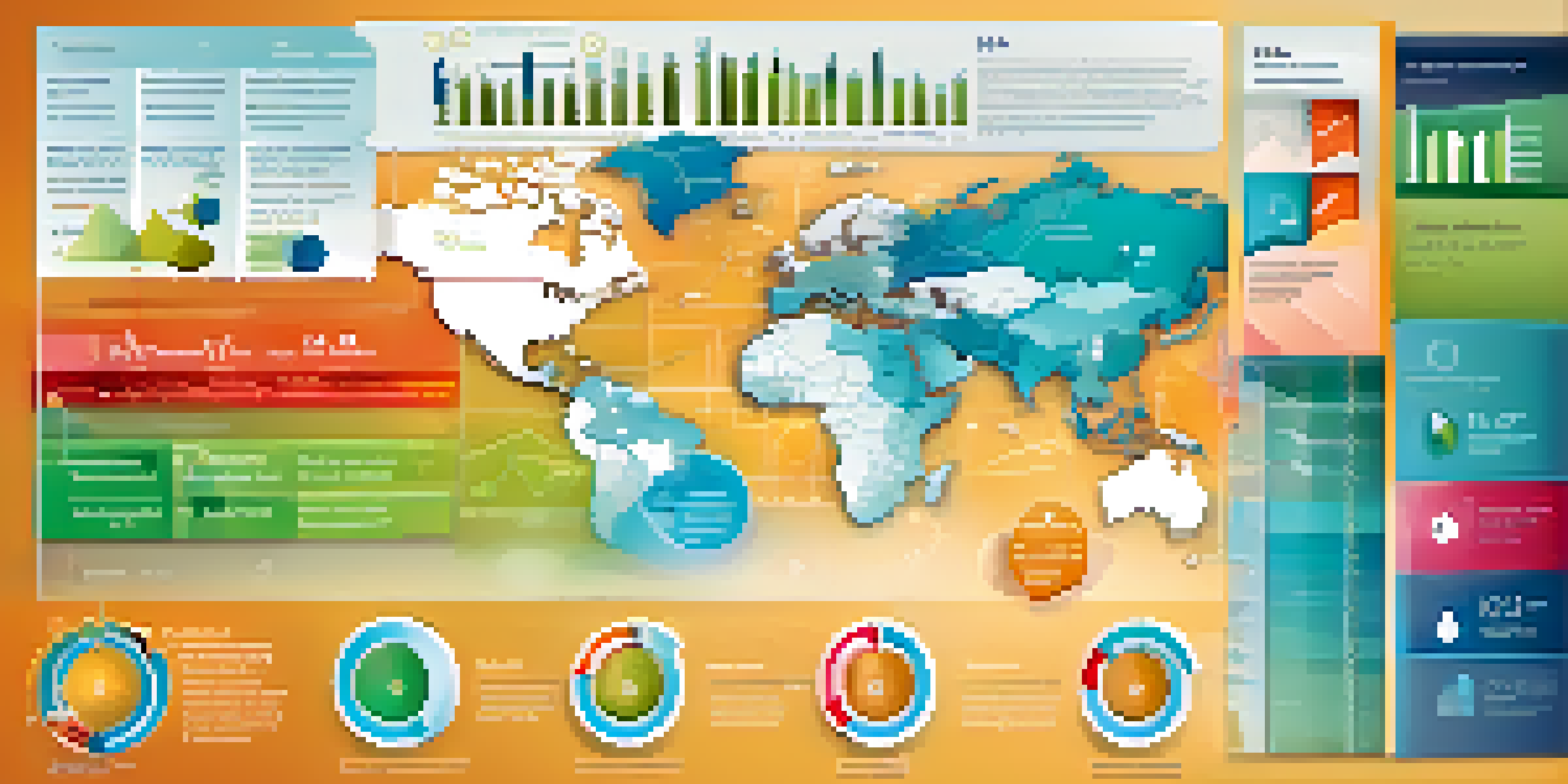
Data visualization is the graphical representation of information and data. It transforms complex data sets into visual formats like charts, graphs, and maps, making them easier to understand. This simplification is crucial in today's data-driven world where businesses face overwhelming amounts of information daily.
Data visualization gives us a way to see and understand our data in a more meaningful way.
Using visual elements helps highlight trends, patterns, and correlations that might go unnoticed in text-based data. For instance, a simple line graph can show sales trends over time more effectively than a page full of numbers. Thus, data visualization acts as a bridge between raw data and actionable insights.
Moreover, effective data visualization not only enhances comprehension but also improves retention. When consumers can visualize data, they are more likely to remember it and apply it to their decision-making processes. This is particularly valuable for businesses looking to influence consumer behavior.
How Data Visualization Enhances Consumer Insights
Data visualization turns raw data into compelling stories that resonate with consumers. By presenting information in an engaging manner, businesses can effectively communicate their messages and encourage consumer engagement. For example, an interactive dashboard allows users to explore data at their own pace, fostering a deeper understanding.

Additionally, visualizations can provide immediate insights that drive timely decisions. For instance, a heat map can reveal which products are performing best in specific regions, enabling businesses to tailor their marketing strategies accordingly. This agility in responding to consumer behavior is invaluable in a competitive marketplace.
Data Visualization Simplifies Insights
Data visualization transforms complex data into visual formats, making it easier to identify trends and patterns.
Furthermore, visual data representations enhance collaboration within teams. When everyone can see and interpret the same visuals, it leads to more informed discussions and decisions. This shared understanding is particularly important for cross-functional teams working towards common goals.
The Role of Interactivity in Data Visualization
Interactivity in data visualization allows consumers to engage with the data actively, rather than passively absorbing it. Tools like sliders, filters, and clickable charts empower users to manipulate data based on their preferences, leading to a personalized experience. This level of engagement can significantly enhance understanding and retention.
The goal is to turn data into information, and information into insight.
For example, an e-commerce site might use an interactive visualization to show product performance across various demographics. This allows consumers to filter results based on their interests, providing insights that are relevant to them. Such tailored experiences can lead to higher conversion rates.
Moreover, interactive visualizations can facilitate exploration and discovery. Consumers can uncover insights that they might not have initially considered, leading to more informed decisions. This explorative approach encourages curiosity and deeper engagement with the data.
Using Data Visualization to Track Consumer Behavior
Data visualization tools are invaluable for tracking consumer behavior over time. By visualizing data from various touchpoints—like website visits, social media interactions, and purchase patterns—businesses can identify trends and shifts in preferences. This information is crucial for adjusting marketing strategies and improving customer experiences.
For instance, a retailer might analyze customer feedback and sales data through visual charts to understand product popularity. This enables them to stock up on in-demand items and phase out less popular ones, aligning inventory with consumer desires. Such data-driven decisions can significantly enhance customer satisfaction.
Interactivity Enhances Engagement
Interactive visualizations allow users to explore data actively, leading to a more personalized and engaging experience.
Additionally, visualizing consumer behavior can reveal insights about customer journeys. Businesses can map out the steps consumers take from awareness to purchase, identifying potential bottlenecks. By addressing these issues, companies can streamline the buying process and improve overall conversion rates.
Leveraging Data Visualization for Market Analysis
Market analysis is another area where data visualization shines. By visualizing market trends, competitive landscapes, and consumer demographics, businesses can make informed strategic decisions. For example, a pie chart can illustrate market share distribution, helping companies identify potential areas for growth.
Moreover, visual tools can highlight emerging trends that may impact the market. By analyzing data patterns, businesses can anticipate shifts in consumer preferences and adapt their strategies proactively. This foresight can provide a competitive edge in fast-paced markets.
In addition, visualizing geographic data can reveal regional differences in consumer behavior. Companies can use maps to analyze sales performance across locations, allowing them to tailor marketing efforts to meet local demands. This localized approach can enhance relevance and effectiveness.
The Future of Data Visualization in Consumer Insights
As technology continues to evolve, so does the potential for data visualization in understanding consumer insights. The rise of artificial intelligence and machine learning is leading to more sophisticated visualization tools that can predict trends and automate data analysis. This means businesses can gain insights faster and with greater accuracy.
Furthermore, advancements in augmented reality (AR) and virtual reality (VR) are set to revolutionize how we visualize data. Imagine being able to explore data in a 3D space, providing a more immersive understanding of complex information. Such innovations could transform data analysis into a more intuitive and engaging experience.
Best Practices Ensure Effectiveness
Following best practices in data visualization, such as prioritizing clarity and choosing the right formats, maximizes impact and comprehension.
Ultimately, the future of data visualization holds immense promise for businesses seeking to deepen their understanding of consumer behavior. By embracing these technological advancements, companies can ensure they remain at the forefront of their industries, leveraging insights to drive success.
Best Practices for Effective Data Visualization
To maximize the impact of data visualization, it’s essential to adhere to best practices. First and foremost, clarity should be the top priority. Visuals should be designed to convey information quickly and effectively, avoiding unnecessary complexity that might confuse the audience. Simple designs often yield the best results.
Additionally, choosing the right type of visualization is crucial. Different data sets are best represented by specific formats—bar charts for comparisons, line graphs for trends, and scatter plots for correlations. Understanding these nuances can significantly enhance the audience's comprehension of the data.

Lastly, always consider your audience when designing visualizations. Tailoring visuals to meet the needs and preferences of your target demographic will increase engagement. By keeping these best practices in mind, businesses can ensure their visualizations are not only attractive but also informative.