Top 10 Data Visualization Tools for Effective Storytelling
Why Data Visualization is Key to Storytelling
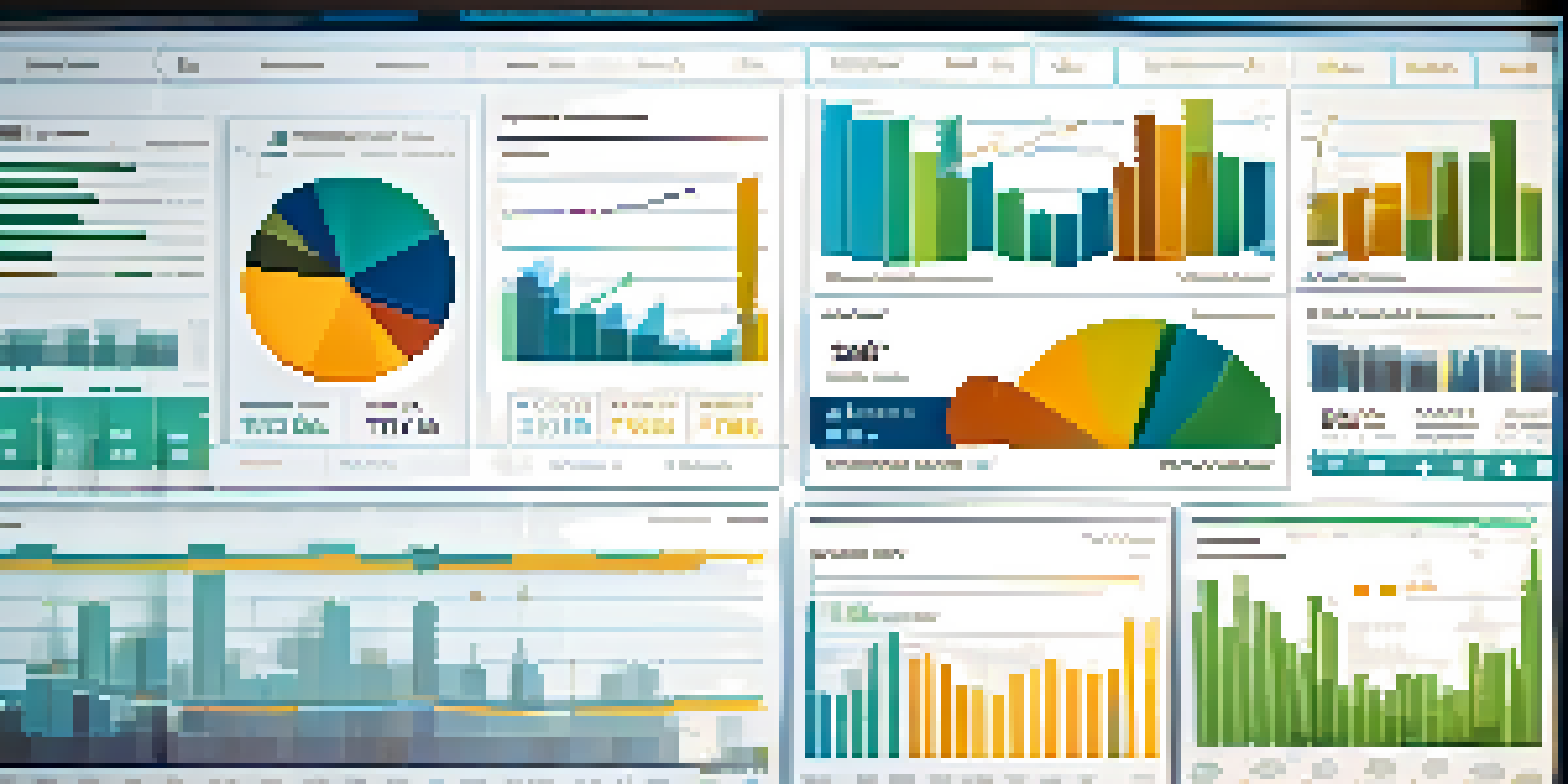
Data visualization is the art of turning data into visual stories. By presenting complex information in a visual format, it becomes easier for audiences to grasp key insights quickly. Think of it like the difference between reading a dense novel and watching an engaging movie adaptation; visuals make the message more memorable.
Data is the new oil. It's valuable, but if unrefined, it cannot really be used.
When we visualize data, we tap into the brain's ability to process images faster than text. This means that a well-designed chart or infographic can communicate trends and patterns at a glance. It's not just about making things pretty; it's about making data accessible and impactful.
Effective storytelling through data not only informs but also persuades. Whether you're trying to convince stakeholders or educate an audience, the right visualization tools can help you present your data in a way that resonates and drives action.
1. Tableau: The Industry Standard for Data Visualization
Tableau is a powerhouse in the world of data visualization, known for its robust capabilities and user-friendly interface. It allows users to create interactive and shareable dashboards that illustrate data insights in real-time. Whether you're a beginner or an experienced data analyst, Tableau has something to offer everyone.

One of the standout features of Tableau is its ability to connect to numerous data sources, making it easy to pull in data from various platforms. This flexibility enables users to create comprehensive visualizations that tell a complete story. Plus, its drag-and-drop functionality means you can focus on storytelling rather than getting lost in technical details.
Data Visualization Enhances Understanding
Visualizing data simplifies complex information, making it easier for audiences to grasp key insights quickly.
With Tableau's community and resources, users can find inspiration and support to elevate their data storytelling. From tutorials to forums, the ecosystem surrounding Tableau is vibrant, helping you continually improve your skills and create impactful visual narratives.
2. Power BI: Microsoft’s Dynamic Visualization Tool
Power BI is a popular choice for organizations that already use Microsoft products. This tool integrates seamlessly with Excel and other Microsoft services, allowing users to leverage their existing data without a steep learning curve. It's an excellent option for businesses looking to enhance their reporting capabilities.
The goal is to turn data into information, and information into insight.
One of Power BI's strengths is its ability to create real-time dashboards that can be shared across teams. This feature ensures that everyone stays on the same page, making it easier to drive collaborative decision-making. Imagine a team meeting where everyone has access to the same live data – that's the power of Power BI.
Moreover, Power BI offers a variety of visualization options, from simple charts to complex maps. Its customizable nature means you can tailor your visualizations to fit your specific storytelling needs, ensuring that your data is not just presented but truly understood.
3. Google Data Studio: Free and Accessible Visualizations
Google Data Studio is a fantastic free tool that makes data visualization accessible to everyone. With a Google account, you can create stunning, interactive reports that pull data from various Google services and beyond. This democratization of data is a game-changer for small businesses and freelancers alike.
The collaborative features of Google Data Studio allow multiple users to work on reports simultaneously, much like Google Docs. This real-time collaboration fosters teamwork and ensures that everyone can contribute their insights effectively. It’s a great way to harness collective knowledge and create visual stories that reflect diverse perspectives.
Powerful Tools for Every User
From Tableau to Google Data Studio, there are various tools available that cater to both beginners and advanced users in data visualization.
In addition, Data Studio's integration with Google Analytics makes it especially useful for marketers. You can visualize web traffic data, campaign performance, and user behavior in one place, helping to craft data-driven marketing strategies that resonate with audiences.
4. D3.js: For the Code Savvy Data Storyteller
D3.js is a JavaScript library that empowers developers to create highly customizable visualizations. If you have some coding skills, D3.js opens up a world of possibilities for crafting unique and interactive data stories. It’s like being an artist with an unlimited canvas; the only limit is your imagination.
What sets D3.js apart is its flexibility. You can bind data to the DOM (Document Object Model) and apply data-driven transformations to create dynamic visualizations. This means you can tell your story in exactly the way you envision, without being constrained by template limitations.
However, D3.js does come with a learning curve. It’s best suited for those who are comfortable with coding and want to push the boundaries of traditional data visualizations. If that's you, D3.js can help you create stunning visuals that not only inform but also captivate your audience.
5. Infogram: Simplifying Infographics Creation
Infogram is an intuitive tool designed for creating infographics and reports without needing design skills. With its drag-and-drop interface, you can easily turn your data into eye-catching visuals that engage your audience. It’s perfect for marketers, educators, and anyone looking to simplify their storytelling.
What makes Infogram stand out is its vast library of templates and assets. You can choose from a wide range of styles and formats, ensuring that your visuals align with your brand’s voice and message. It’s like having a design team at your fingertips, ready to help you share your data story.
Collaboration Drives Data Storytelling
Many visualization tools emphasize collaboration, allowing teams to create and share insights effectively, fostering a data-driven culture.
Additionally, Infogram allows for easy sharing and embedding of your visuals across different platforms. Whether it's on a website, social media, or in a presentation, you can showcase your data effectively and reach a broader audience.
6. Qlik Sense: Data Discovery Made Easy
Qlik Sense is a self-service data visualization tool that enables users to discover insights from their data effortlessly. Its associative model allows users to explore data in a more intuitive way, making it easier to identify trends and patterns. This is particularly useful for those who want to derive insights without getting bogged down by complex queries.
One of the most compelling features of Qlik Sense is its storytelling capability. Users can create guided analytics experiences, where they can narrate a data story through a sequence of visualizations. This approach ensures that the audience can follow along and understand the insights being presented.

Moreover, Qlik Sense supports a wide range of data sources, making it a versatile option for organizations with varied data needs. Whether you’re working with cloud data, on-premises databases, or spreadsheets, Qlik Sense can help you weave a compelling narrative from your data.
7. Chart.js: Simple Yet Powerful for Basic Charts
Chart.js is a simple, flexible JavaScript library for creating basic charts. If you're looking to get started with data visualization without overwhelming complexity, Chart.js is a great choice. It allows you to create beautiful, responsive charts that are perfect for web applications.
One of the key benefits of Chart.js is its ease of use. With just a few lines of code, you can create bar charts, line charts, pie charts, and more. This simplicity makes it accessible for beginners while still providing enough flexibility for more advanced users to customize their charts.
While Chart.js might not have all the bells and whistles of more complex tools, it excels at delivering clear, straightforward visualizations. It’s an ideal choice for projects where clarity is paramount, allowing your data to shine without unnecessary distractions.
8. Looker Studio: A Comprehensive Reporting Tool
Looker Studio, formerly known as Google Data Studio, is an advanced reporting and data visualization tool. It offers various data connectors, allowing you to visualize data from multiple sources seamlessly. This makes it a powerful choice for businesses that need to consolidate data from various departments.
One of Looker Studio's strengths is its emphasis on collaboration and sharing. Teams can work together on reports and dashboards, ensuring everyone has access to the latest insights. This collaborative approach promotes transparency and helps drive data-driven decision-making.
Additionally, Looker Studio allows users to create custom calculations and metrics, tailoring the visualizations to their specific needs. This flexibility ensures that you can craft a data story that not only reflects your organization's goals but also resonates with your audience.