Visualizing Big Data: Tools That Handle Massive Datasets
Understanding the Importance of Data Visualization
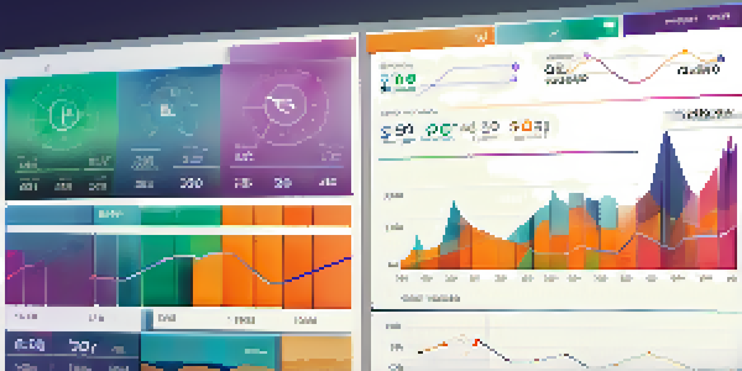
Data visualization transforms complex data into visual formats, making it easier to interpret. Imagine trying to find your way in a city without a map; that’s what dealing with raw data feels like. By visualizing data, patterns, trends, and outliers become clear, allowing for quicker insights and informed decisions.
Data is the new oil, but like oil, data has to be refined to be valuable.
For instance, a graph showing sales over time can instantly reveal seasonal trends, something that raw numbers might obscure. This clarity is crucial in today’s data-driven world, where organizations rely on insights to stay competitive. In essence, visualization is not just about aesthetics; it's about enhancing comprehension and engagement with data.
Moreover, effective data visualization can facilitate better communication within teams and with stakeholders. When everyone can see and understand the data, it fosters collaboration and drives strategic initiatives. Therefore, investing in visualization tools is essential for leveraging the full potential of big data.
Choosing the Right Visualization Tools for Your Needs
With a plethora of visualization tools available, selecting the right one can feel overwhelming. It’s like trying to choose the perfect outfit from a packed closet; you need to consider your specific needs and objectives. Factors such as the size of your dataset, the complexity of the analysis, and your team's technical skills play a significant role in this decision.

For example, Tableau is known for its user-friendly interface and powerful features, making it suitable for both beginners and advanced users. On the other hand, tools like D3.js cater to developers who want complete control over the design and functionality of their visualizations. By evaluating your requirements and resources, you can find a tool that aligns perfectly with your goals.
The Power of Data Visualization
Data visualization simplifies complex data, making patterns and insights more accessible for informed decision-making.
Additionally, consider scalability and integration capabilities. As your data grows, your tool should grow with it, seamlessly integrating with your existing systems. This foresight will save you time and resources in the long run, ensuring consistent and effective data visualization.
Top Tools for Visualizing Big Data in 2023
In 2023, several tools stand out for their ability to handle massive datasets effectively. Power BI, for instance, offers robust analytical capabilities and integrates well with Microsoft products, making it a favorite among businesses already using the Microsoft ecosystem. Its intuitive drag-and-drop interface allows users to create compelling visualizations without extensive technical knowledge.
Visualization is the most powerful way to help people understand data.
Another noteworthy tool is Google Data Studio, which enables real-time collaboration and sharing, perfect for teams working remotely. Its ability to pull data from various sources, including Google Analytics and Google Ads, makes it a versatile choice for marketers. Each tool has unique features, so exploring them can help you find the perfect fit for your needs.
Lastly, Apache Superset is gaining traction for its open-source nature and ability to handle vast amounts of data efficiently. It’s ideal for organizations looking to customize their visualizations without hefty license fees. By keeping an eye on these tools, you can stay ahead in the evolving landscape of data visualization.
The Role of AI in Data Visualization
Artificial Intelligence (AI) is revolutionizing data visualization by automating complex processes and enhancing insights. Imagine having a personal data analyst; that’s what AI tools can offer. They can sift through massive datasets, identify trends, and suggest the best ways to visualize the data, saving time and resources.
For example, tools like Google Cloud AutoML can create visualizations that adapt based on the data provided, tailoring the output to highlight the most relevant information. This ability to automate mundane tasks allows data professionals to focus on strategic analysis rather than repetitive work. Furthermore, AI can improve the accuracy of predictions by analyzing historical data patterns.
Choosing the Right Tools Matters
Selecting the appropriate visualization tools based on your dataset and team capabilities is crucial for effective analysis.
As AI continues to evolve, its integration with visualization tools will likely become more sophisticated. This means we can expect even more intuitive interfaces and powerful insights at our fingertips. Embracing AI in your data visualization strategy can give your organization a significant competitive edge.
Best Practices for Effective Data Visualization
Creating effective data visualizations involves more than just choosing the right tool; it requires a thoughtful approach to design and storytelling. Think of your visualization as a narrative; it should guide the viewer through the data in a clear and compelling way. Start by defining your audience and the message you want to convey, ensuring that the design aligns with both.
For instance, using appropriate colors can enhance readability and convey emotions related to the data. Avoid clutter by focusing on key data points and eliminating unnecessary distractions. Remember, simplicity often leads to better understanding, so aim for a clean layout that highlights the insights without overwhelming the viewer.
Lastly, always test your visualizations with real users to gather feedback. This iterative process will help you refine your visuals, making them more effective and user-friendly. By following these best practices, you can create visualizations that not only inform but also engage and inspire action.
Real-World Applications of Data Visualization
Data visualization finds applications across various industries, from healthcare to finance, transforming how organizations make decisions. For instance, hospitals use visualizations to track patient data in real-time, helping doctors and nurses respond quickly to critical situations. By visualizing patient trends, healthcare providers can improve outcomes and streamline operations.
In the finance sector, visualizing market trends allows investors to make informed decisions based on real-time data. Dashboards showcasing stock performance, economic indicators, and market volatility can help traders identify opportunities and risks effectively. This proactive approach enhances financial strategies and boosts profitability.
AI Enhances Visualization Efficiency
AI is transforming data visualization by automating processes and providing tailored insights to improve decision-making.
Moreover, in marketing, visualizing customer data can reveal valuable insights into consumer behavior. Businesses can identify patterns in purchasing habits, enabling them to tailor their campaigns for maximum impact. These real-world applications demonstrate the power of data visualization in driving meaningful change across industries.
Future Trends in Data Visualization Technology
As technology evolves, so does the field of data visualization, with exciting trends on the horizon. One significant trend is the increasing use of augmented reality (AR) and virtual reality (VR) for data visualization. Imagine being able to walk through a 3D representation of your data; this immersive experience can enhance understanding and engagement like never before.
Another trend is the growing emphasis on real-time data visualization. With the rise of IoT (Internet of Things), businesses need tools that can analyze and visualize data in real time to respond quickly to changes. This shift will require more robust and flexible visualization tools that can handle streaming data effectively.

Lastly, personalization in data visualization is becoming more prevalent, allowing users to customize their dashboards and reports based on individual preferences and needs. This tailored approach enhances user experience and ensures that stakeholders can quickly access the insights that matter most to them. Keeping an eye on these trends will help you stay ahead in the ever-changing landscape of data visualization.