Visual Hierarchy in HCI: Guiding User Attention Effectively
What is Visual Hierarchy in Human-Computer Interaction?
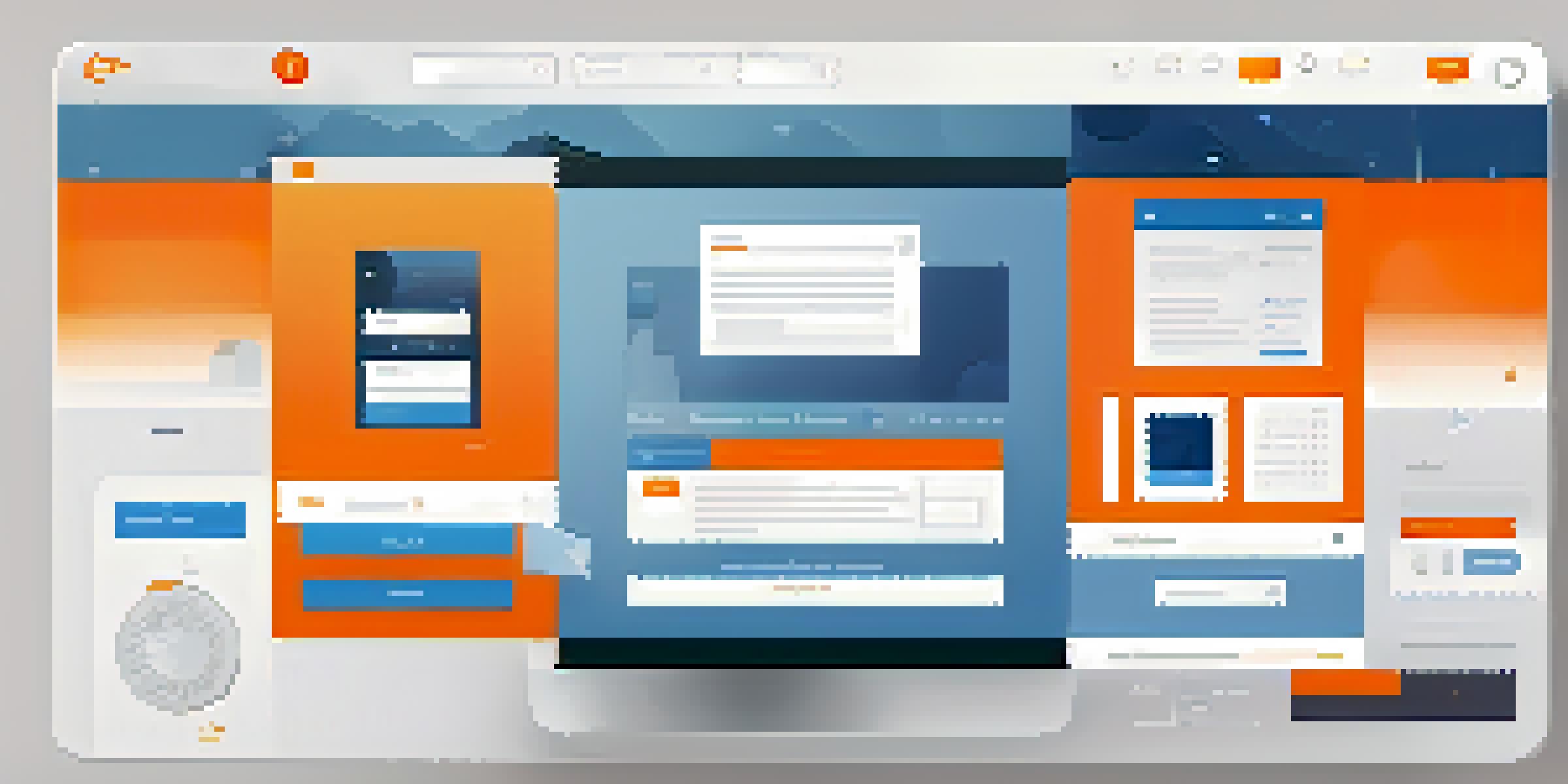
Visual hierarchy is a crucial design principle that dictates how elements are arranged to guide user attention. In the context of Human-Computer Interaction (HCI), it helps users navigate interfaces more intuitively. Think of it like a roadmap; just as a map highlights the most important routes, visual hierarchy directs users’ focus to the key components of a digital interface.
The Importance of Visual Hierarchy in User Experience
Creating a strong visual hierarchy improves usability and overall user experience. When users can easily identify the most important elements, they can accomplish their tasks more efficiently. For example, a well-structured website allows visitors to find information quickly, reducing frustration and enhancing satisfaction.
Visual Hierarchy Guides Attention
Visual hierarchy is essential in HCI as it directs user focus to key interface elements, similar to how a roadmap highlights important routes.
Elements That Influence Visual Hierarchy
Several design elements contribute to visual hierarchy, including size, color, contrast, and spacing. Larger elements typically draw more attention, while contrasting colors can highlight essential features. Imagine a brightly colored 'Sign Up' button on a muted background; it naturally directs users to take action.
How Size and Scale Affect Perception
Size plays a significant role in how users perceive importance and relevance. Larger text or images are often seen as more important than smaller ones. For instance, headlines are typically larger than body text, signaling to users that they should focus on that content first.
Size and Color Enhance Usability
Elements like size and contrasting colors play a crucial role in establishing importance, making it easier for users to identify and engage with key features.
Color and Contrast: Tools for Engagement
Color and contrast can dramatically alter the effectiveness of visual hierarchy. Using contrasting colors for buttons or calls to action makes them stand out against the background. For example, a bright red alert box on a white page draws immediate attention and prompts users to engage with the content.
Spacing and Layout: Creating Breathing Room
Spacing is another critical aspect of visual hierarchy that often gets overlooked. Adequate white space around elements helps to separate them, making it easier for users to digest information. Think of it as giving a book enough margin space; it makes reading less daunting and more enjoyable.
Spacing Improves Information Clarity
Adequate spacing around elements can significantly enhance readability and user experience by providing necessary breathing room for content.
Using Visual Hierarchy for Better Navigation
Effective visual hierarchy also enhances navigation by logically guiding users through content. By arranging elements in a clear and intuitive way, users can quickly understand where to go next. Consider a well-organized menu that prioritizes the most used options; it simplifies the user journey.
Conclusion: Mastering Visual Hierarchy in HCI Design
In conclusion, mastering visual hierarchy is essential for creating effective HCI designs. By understanding how elements interact to guide user attention, designers can enhance usability and satisfaction. Ultimately, a well-executed visual hierarchy not only improves user experience but also drives engagement and conversions.