Designing for Mobile: Key Considerations for UX Success

Understanding the Mobile User Experience Landscape
Mobile user experience (UX) has evolved dramatically in recent years. With more users accessing websites and apps on their phones, understanding mobile UX is crucial. It’s not just about making things look good; it’s about creating a seamless experience that feels intuitive and enjoyable.
Design is not just what it looks like and feels like. Design is how it works.
Think about it: when you’re on the go, you want information quickly and easily. Mobile UX should prioritize speed, accessibility, and clarity. Users often have specific tasks in mind, whether it’s checking the weather or making a purchase, and your design should facilitate that.
This shift towards mobile-first design means that UX designers need to think critically about how features translate to smaller screens. A website that works perfectly on a desktop might falter on mobile if not thoughtfully optimized.
Prioritizing Simplicity in Mobile Design
Simplicity is the name of the game when designing for mobile. With limited screen space, every element must serve a purpose, whether it’s a button, image, or piece of text. Overloading your design with unnecessary features can overwhelm users and lead to frustration.

Consider a minimalist approach where each screen communicates a single idea or action. This simplicity not only enhances user experience but also makes navigation more intuitive. Just think of your favorite mobile apps; they often have a clean layout that focuses on what matters most.
Prioritize Simplicity in Design
A minimalist approach enhances user experience by ensuring every element serves a clear purpose.
By stripping away excess, you allow users to focus on their tasks without distractions. This clarity can significantly improve user satisfaction and encourage them to return to your app or site.
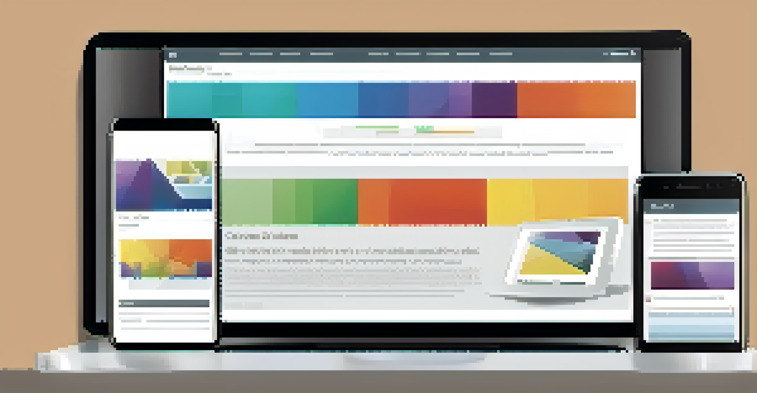
Responsive Design: A Must for Mobile UX
Responsive design is a crucial aspect of mobile UX. This approach ensures that your website or app adapts to various screen sizes, providing a consistent experience across devices. When a user switches from a smartphone to a tablet, they should feel right at home.
The user experience is the most important thing. It’s not about the technology, it’s about how the user feels when they use the product.
Implementing a responsive design means using flexible grids and layouts, which adjust seamlessly as the screen size changes. This way, the content remains readable, and navigation remains intuitive, regardless of the device.
Remember, your users are diverse, using different devices for different tasks. A responsive design caters to this variety, helping you reach a broader audience while maintaining a high-quality user experience.
Optimizing Touch Interactions for Mobile Users
Touch interactions are at the heart of mobile UX. Unlike desktop users who rely on a mouse, mobile users navigate by tapping, swiping, and pinching. This shift in interaction demands careful consideration in your design.
Buttons should be large enough to tap easily, and gestures must feel natural. For example, a swipe to reveal a menu should be intuitive, while a long press might bring up additional options. The goal is to make interactions feel effortless.
Responsive Design is Essential
Responsive design adapts your site to various devices, providing a consistent user experience across screens.
Moreover, consider feedback for touch actions. Visual cues like color changes or animations when a button is pressed can significantly enhance user satisfaction and provide reassurance that their actions have been recognized.
Loading Speed: The Key to Retaining Mobile Users
In the fast-paced mobile world, loading speed can make or break your UX. Users expect instant access to information, and even a second delay can lead to frustration and abandonment. Therefore, optimizing your site for speed is non-negotiable.
This can involve various strategies, such as compressing images, minimizing code, and reducing redirects. The faster your site loads, the more likely users are to stick around and engage with your content.
Remember, a smooth, quick experience encourages users to explore further and increases the likelihood of conversions. Prioritizing speed not only enhances user experience but can also positively impact your search engine rankings.
Accessibility in Mobile UX: Designing for Everyone
Accessibility is an essential consideration in mobile UX design. A well-designed mobile site or app should cater to users with varying abilities. This means ensuring that everyone, including those with disabilities, can navigate and interact with your content effectively.
Incorporating features like screen reader compatibility, adjustable text sizes, and color contrast options can make a significant difference. By designing with accessibility in mind, you not only meet legal requirements but also expand your audience.
Loading Speed Matters
Fast loading times are crucial for retaining mobile users, as even a slight delay can lead to frustration and abandonment.
Ultimately, creating an inclusive experience enriches the overall user experience and fosters a sense of belonging among all users. Accessibility should never be an afterthought; it should be an integral part of your design process.
User Testing: The Backbone of Successful Mobile Design
User testing is a vital step in the mobile design process. Engaging real users to evaluate your design can uncover insights that you might not have considered. Testing helps you understand how people interact with your app or site and what challenges they face.
Conducting usability tests can reveal pain points in navigation, loading times, and overall usability. This feedback allows you to make informed adjustments, ensuring that your design aligns with user expectations.
Emphasizing user testing throughout your design cycle fosters an iterative approach, leading to continuous improvement. After all, your ultimate goal is to create a user-friendly experience that meets the needs of your audience.