Using Python Libraries for Advanced Data Visualization Techniques
Introduction to Data Visualization with Python Libraries
Data visualization is the art of representing data in a visual context, making complex information accessible. Python offers a variety of libraries that empower users to create stunning and insightful visualizations. Whether you're a data scientist, analyst, or just someone looking to understand their data better, these tools can be incredibly helpful. In this article, we'll explore the top Python libraries for advanced data visualization techniques.
Matplotlib: The Foundation of Python Visualization
Matplotlib is often the first library that comes to mind for Python data visualization. It's versatile and allows for the creation of static, animated, and interactive plots. Think of it as the Swiss Army knife of plotting; it provides the basic tools to get you started and can be customized in countless ways. From simple line graphs to complex 3D plots, Matplotlib lays the groundwork for visual storytelling with data.
Python Libraries for Visualization
Python offers a variety of libraries that empower users to create stunning and insightful visualizations.
Seaborn: Making Statistical Graphics Beautiful
Seaborn builds on Matplotlib, enhancing its capabilities with a more aesthetically pleasing interface. It’s particularly useful for visualizing statistical relationships, with built-in themes that make your charts look polished and professional. For instance, if you want to visualize the correlation between two variables, Seaborn’s heatmap function makes it simple and visually attractive. This library helps you turn raw data into beautiful graphics effortlessly.
Plotly: Interactive Visualizations for the Web
If you're looking to create interactive visualizations, Plotly is the way to go. This library allows users to build dynamic graphs that can be embedded in web applications and dashboards. Imagine dragging a slider to filter data or hovering over points to get more information—Plotly makes that possible. It’s perfect for presentations or reports where engaging the audience is key.
Matplotlib as a Versatile Tool
Matplotlib serves as the foundational library for creating a wide range of static, animated, and interactive plots.
Bokeh: Real-Time Streaming and Interactive Dashboards
Bokeh is designed for creating interactive plots and dashboards, particularly for large datasets. Its capability to handle real-time streaming data sets it apart from other libraries. Picture a live dashboard displaying the latest stock prices or sensor data—Bokeh can handle that elegantly. This library is especially beneficial for applications where timely data insights are crucial.
Altair: Declarative Statistical Visualization
Altair takes a different approach by using a declarative syntax—meaning you describe what you want to visualize rather than how to do it. This can make the code cleaner and easier to understand, especially for complex visualizations. For example, you can quickly create sophisticated statistical graphics with minimal code. Altair is perfect for those who appreciate a clear and concise way to express their visual data needs.
Choosing the Right Library Matters
Selecting the appropriate library depends on your specific needs, whether for static graphs, interactive dashboards, or beautiful statistical displays.
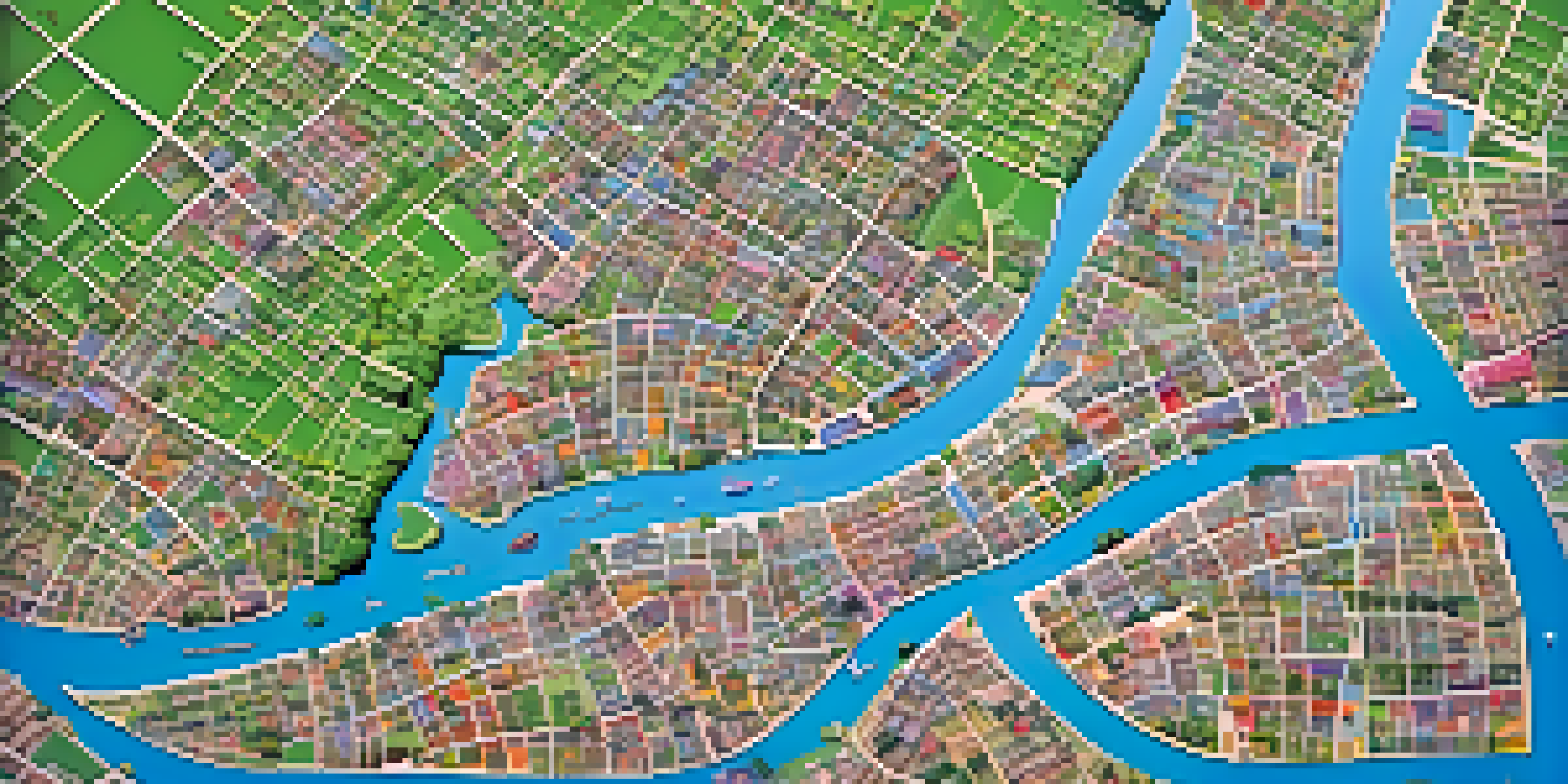
Geopandas: Visualizing Geographic Data
Geopandas extends the capabilities of Pandas to allow for geographic data visualization. If you're working with maps or spatial data, this library is invaluable. It enables you to plot geographic data on top of various map layers with ease. Imagine visualizing the population density of a city or displaying election results on a map—Geopandas makes these tasks straightforward.
Conclusion: Choosing the Right Library for Your Needs
With so many Python libraries available, choosing the right one depends on your specific needs and the type of data you're working with. Whether you need static plots, interactive dashboards, or beautiful statistical graphics, there's a library for that. As you embark on your data visualization journey, consider experimenting with different libraries to find what best suits your style. Ultimately, the goal is to turn your data into compelling stories that drive insights and decisions.